Splitwise
Unifying Expenses Made Easy: Exploring UX Innovations in Splitwise
Splitwise simplifies the process of dividing bills and shared expenses among friends, roommates, and groups, with a focus on an intuitive and user-friendly interface. Our team’s goal was to conduct user research to further understand the users’ pain points as well as to improve the visual design of accurately reflecting who paid for what within a group experience.
Role
User Research
Product Strategy
UI Design
Interaction Design
Usability Testing
Tools
Figjam
Notion
Maze
Figma
Dovetail
Google Forms
Timeline
5 weeks
2 team members
BEFORE
AFTER
Business & User Frustrations
The primary user frustration stemmed from the app's lack of engagement as a shared expense platform, leading to usability concerns. In response, we prioritized enhancing the app's user experience, aiming to create a more inviting and user-friendly environment for seamless collaboration on expenses.
The second major user frustration centered around reluctance in reminding colleagues about owed money, prompting the need for a more visually intuitive feature to facilitate money reminders among friends.
Competitor Benchmarking
To address the stated frustrations, we conducted a thorough analysis by comparing Splitwise with one indirect and two direct competitors. This evaluation aimed to identify potential features or solutions that could assist us in resolving the user concerns and improving the overall user experience of our app.
Problem
We conducted 10 user interviews and received 50 survey responses. We learned that a reoccurring problem users faced was a failure for their borrowers to pay them back on time or even at all. Additionally, in regards to Splitwise’s current user experience, we learned that users would like to categorize their expenses and be able to review it in a simpler format.
Business Goal
"Our goal is to enhance the user experience in categorizing expenses and tracking payments in Splitwise to increase adoption of our paid product. By implementing intuitive and transparent features that accurately reflect who has paid for what, we aim to foster trust and accountability among users, leading to higher conversion rates and sustained growth for our business."
Solution
To tackle these challenges, we pursued an extensive improvement initiative focusing on elevating the app's visual appeal and user experience. We reimagined the user interface to make it easier to see who is paying for what and who all is apart of the group. Next, we implemented an intuitive categorization system, enabling users to create custom expense tags. Additionally, we optimized the process of adding individuals to shared expenses, resulting in a more refined and efficient Splitwise platform.
Ideation
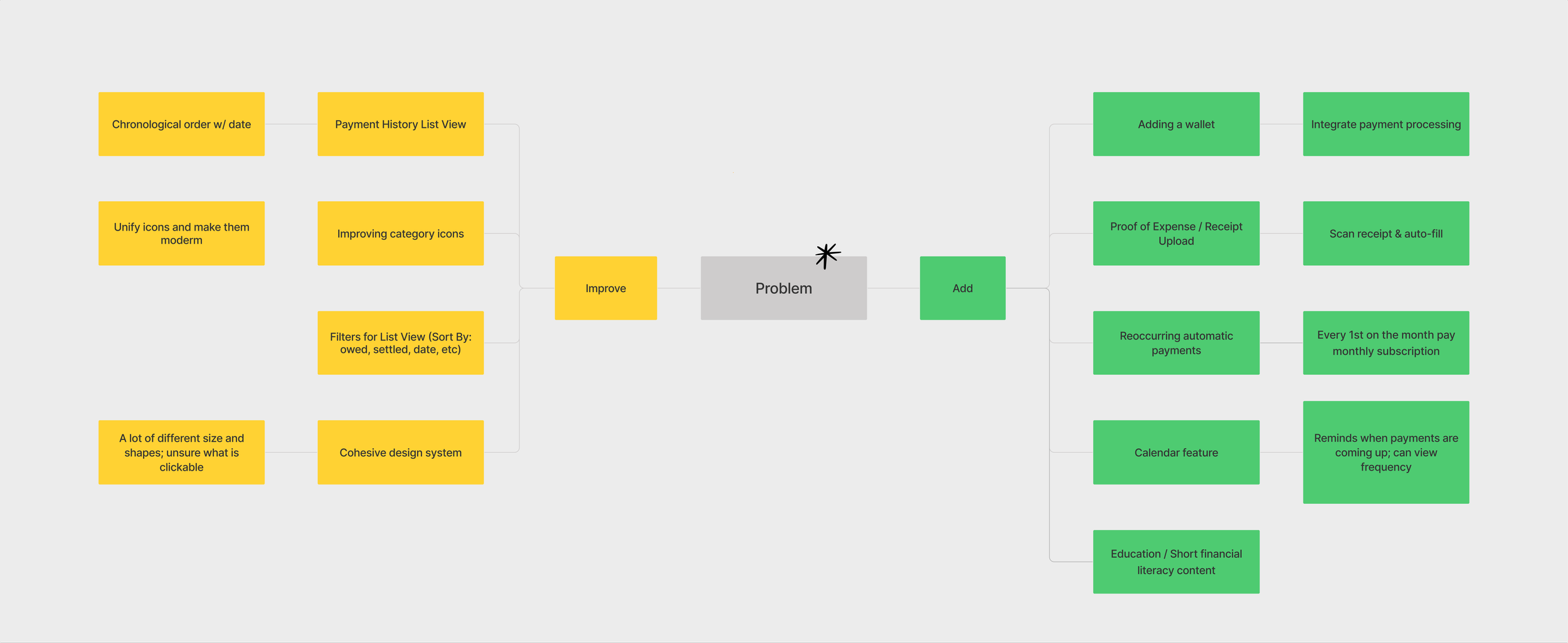
Having defined the problem, we progressed to the ideation stage, crafting a comprehensive mind map. This visual representation allowed us to brainstorm and identify key areas for improvement and additions, setting a clear direction for enhancing the app's functionalities and user experience.
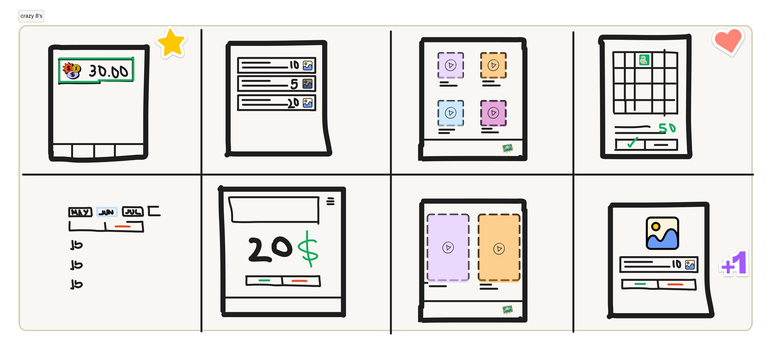
With the identified items in hand, we carefully selected the most promising ideas that aligned with our envisioned solution. To swiftly visualize these concepts, each team member engaged in a "Crazy 8's" challenge, rapidly sketching and exploring various design possibilities. This collaborative exercise facilitated the generation of creative solutions and paved the way for a more refined and innovative approach to address the user frustrations.
What can we add
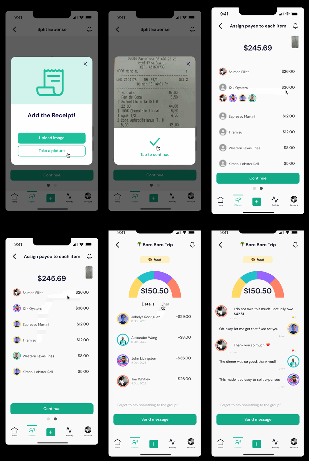
We plan to introduce a "Proof of Expenses" feature allowing users to upload receipts with AI auto-fill. AI will track each line item on the receipt allowing users to assign the payee. AI will also automatically source the date allowing users to skip that step for efficiency. Additionally, a calendar feature with payment reminders will streamline expense management further. As well as a chat feature allowing users to communicate about their group expenses. These enhancements aim to create a more user-friendly and efficient Splitwise user experience.
What can we improve
We're enhancing the payment history with a sleek chronological order, elevating categorization with friendlier icons, and implementing a cohesive design system, bringing a cool and modern touch to Splitwise for a more user-friendly and visually appealing experience.
Userflows
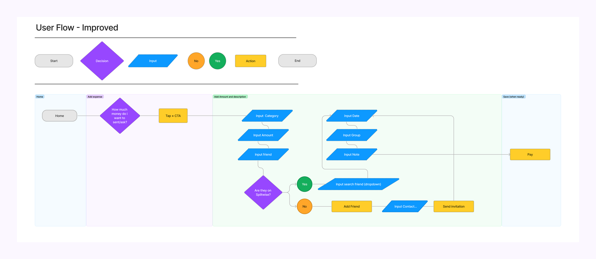
Prior to delving into the sketching phase, we first focused on reorganizing and clarifying the challenge's flow. This involved creating the current user flow and subsequently refining it to align with our objectives and goals for the project. This crucial step laid the foundation for a more purposeful and effective design process.
Rapid Prototyping
Once we had defined the user flow, we progressed to generate our wireframes using rapid prototyping methods.
Styles & Components
Splitwise had only one primary color, but we wanted to create a broader range of colors to make the application more visually appealing and user-friendly.
High Fidelity Prototype
Add a receipt
Test Outcomes
We've learned that users crave a finance app that's not only user-friendly but also intuitively fun when dealing with numbers, money, and finances. The fact that users can add their own categories and organize their finances their way keeps them coming back to the app.
Three Key Learnings
1. Importance of consistent collaboration with group partners which resulted in a successful case study.
2. The importance of developing a strong user flow and mock ups before designing which allowed us to clearly see what areas can be improved.
3. Users were thrilled with the app's shorter, effortless, and ultra-intuitive process.
We spent an hour flushing out quick prototypes of what we would love to implement next which were features outside of the scope of our case study brief requirements. We would like to introduce a search feature for quick and convenient referencing for split expenses. Additionally, we would like to integrate a AI ‘Image to Text’ which will allow users to upload a receipt and have all of their expense details automatically filled. Lastly, a chat feature which would allow users to discuss their expense to make sure all expenses are accounted for.
Search Feature
Split expenses & split equally
Add a category, description, and people to split with
Usability Testing
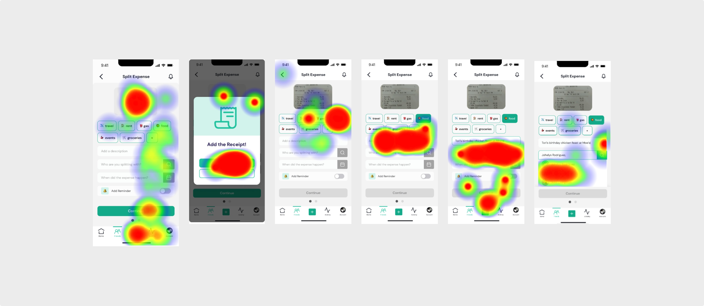
Once we finalized our prototype, we used the program Maze to create a usability test for users to give us detailed feedback on our prototype.


